Table of Contents
Color Theory in Painting Basics
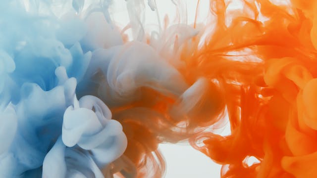
When it comes to painting, understanding color theory is essential. Colors have the power to evoke emotions and convey messages in art. The basic color wheel consists of primary colors (red, blue, yellow), secondary colors (green, orange, purple), and tertiary colors. By combining these hues, artists can create a wide range of shades and tones to enhance their artwork.
Additionally, color temperature plays a crucial role in art composition. Warm colors like red, orange, and yellow tend to advance in a painting, while cool colors like blue, green, and purple recede. This knowledge can be utilized to create depth and perspective in a piece. Experimenting with complementary, analogous, and monochromatic color schemes can further enhance the visual impact of a painting, sparking interest and engaging viewers on a deeper level.
Choosing the Right Paintbrushes for painting
When it comes to selecting the appropriate paintbrush for your artwork, there are several factors to consider. The first aspect to keep in mind is the type of bristles – natural hair brushes, such as sable or hog hair, are ideal for oil painting due to their ability to hold and distribute the paint effectively. Conversely, synthetic brushes are better suited for water-based paints like acrylics as they offer a smoother finish. The size of the brush is another crucial factor to consider, with larger brushes being suitable for broad strokes and coverage, while smaller brushes are perfect for detail work and precision.
Furthermore, the shape of the brush plays a significant role in the outcome of your painting. Flat brushes are great for creating clean, even strokes and filling in large areas, while round brushes are versatile and can be used for both detail work and broader strokes. Additionally, angled brushes are excellent for achieving precise lines and edges, making them ideal for intricate designs and outlining. By understanding the various types of paintbrushes available and their specific functions, you can ensure that you select the right tools to bring your artistic vision to life.
Layering Techniques for Depth
Layering techniques are crucial in painting to add depth and dimension to your artwork. By building up layers of paint, you can create a sense of depth that draws the viewer into the piece. Begin by applying a base layer of paint and then gradually add more layers, focusing on enhancing the colors and details. This method allows you to achieve a more realistic and dynamic composition, making the artwork come to life.
Experiment with different blending techniques and opacity levels to create interesting textures and visual effects in your artwork. By carefully layering colors and adjusting the transparency of the paint, you can achieve a sense of depth that adds complexity and richness to your painting. Don’t be afraid to play around with different techniques and see how they interact with each other to create a captivating visual experience for the viewer.
Creating Texture with Different Materials
One way to add visual interest to your artwork is by incorporating various materials to create texture. Experimenting with materials such as sand, fabric, or even tissue paper can add a tactile element to your piece. By layering these materials onto your canvas, you can evoke a sense of depth and dimension, making your artwork more dynamic and engaging.
Another method to create texture is by utilizing unconventional tools such as sponges, palette knives, or even everyday items like credit cards or bubble wrap. These tools can be used to apply paint in unique ways, resulting in interesting textures and patterns. By exploring different techniques and materials, you can discover new ways to add depth and richness to your artwork, allowing you to create visually stimulating pieces that captivate the viewer’s attention.
Utilizing Negative Space in painting
Negative space, also known as white space, is the area surrounding the main subject in an art piece. Contrary to its name, negative space is a critical element that can enhance the focal point of the composition. By strategically incorporating negative space, artists can create a sense of balance and harmony within their work. This technique allows the viewer’s eyes to focus on the main subject while also appreciating the space surrounding it.
When utilizing negative space, it’s essential to consider the impact it has on the overall composition. By carefully manipulating the empty areas around the subject, artists can evoke feelings of tranquility, simplicity, or even tension. Negative space can serve as a visual pause that adds depth and interest to the artwork. Mastering the use of negative space requires a keen eye for composition and an understanding of how leaving certain areas blank can contribute to the overall visual impact of the piece.
• Negative space, also known as white space, is the area surrounding the main subject in an art piece.
• Contrary to its name, negative space is a critical element that can enhance the focal point of the composition.
• By strategically incorporating negative space, artists can create a sense of balance and harmony within their work.
• This technique allows the viewer’s eyes to focus on the main subject while also appreciating the space surrounding it.
When utilizing negative space, it’s essential to consider the impact it has on the overall composition. By carefully manipulating the empty areas around the subject, artists can evoke feelings of tranquility, simplicity, or even tension. Negative space can serve as a visual pause that adds depth and interest to the artwork. Mastering the use of negative space requires a keen eye for composition and an understanding of how leaving certain areas blank can contribute to
the overall visual impact of
the piece.
Incorporating Metallics and Neons
For artists looking to add a contemporary touch to their work, incorporating metallics and neons can bring a vibrant and eye-catching element to any piece. Whether it’s using metallic paints to create a subtle shimmer or incorporating neon shades for a pop of boldness, these elements can elevate the overall aesthetic of the artwork. The reflective quality of metallic paints can add depth and dimension to flat surfaces, while neon colors can create a sense of energy and excitement in the composition.
Experimenting with metallics and neons allows artists to play with light and color in unique ways, creating dynamic effects that draw the viewer’s attention. By strategically incorporating these elements into their work, artists can set their pieces apart and make a bold statement. Whether used sparingly for accents or as the main focus of a piece, metallics and neons have the power to transform a two-dimensional artwork into a visually striking masterpiece.
Blending Colors Seamlessly when painting
Achieving a smooth transition between colors is a crucial skill in painting. To blend colors seamlessly, it is essential to start with a gradual approach. Begin by overlapping the two colors you want to blend and gently mix them together on the canvas. Vary the pressure applied to the brush to create a gradual fade from one color to the next. This technique allows for a harmonious transition between hues, giving your painting a more cohesive and professional look.
Another technique for blending colors seamlessly is to use a dry brush or a blending tool. By lightly dragging the dry brush over the overlapped colors, you can soften the edges and create a subtle blend. Remember to blend in the direction you want the colors to flow, whether it be horizontal, vertical, or circular. This method helps create a seamless transition between colors, ensuring a smooth and visually appealing finish to your artwork.
Adding Dimension with Shadows and Highlights
Achieving a sense of depth and realism in art often relies heavily on the strategic use of shadows and highlights. By incorporating these elements into your artwork, you can create a three-dimensional effect that captivates the viewer’s eye. Shadows help to define form and structure, while highlights add luminosity and draw attention to certain areas within the composition. It is essential to consider the light source in your artwork to ensure that shadows and highlights fall consistently across the piece, creating a cohesive and believable visual narrative.
When working with shadows, pay close attention to how they interact with the objects and subjects within your artwork. Shadows are not just areas of darkness but rather play a vital role in anchoring objects to a surface and conveying the illusion of weight and solidity. On the other hand, highlights can add a sense of vitality and dimension by mimicking the way light interacts with different surfaces, creating the appearance of shine and reflection. By mastering the art of balancing shadows and highlights, you can elevate your artwork to new levels of sophistication and visual interest.
Experimenting with Different Color Schemes
When exploring the world of art, experimenting with various color schemes can breathe life into your creations. Understanding the fundamentals of color theory and how different shades interact can open up a realm of possibilities for your artistic endeavors. By blending complementary or analogous colors, you can evoke different emotions and create visual interest in your work. Playing with warm and cool tones, exploring monochromatic schemes, or daring to mix unexpected hues can lead to surprising and dynamic results that showcase your creativity and vision.
As you delve into the realm of color schemes, consider the impact that saturation and brightness can have on your artwork. By adjusting the intensity of colors, you can convey different moods and add depth to your compositions. Experiment with tonal variations within a single color palette or juxtapose bold, contrasting shades to make a statement. Embrace the power of color psychology and storytelling through your choice of hues, using them to convey themes, narratives, and atmospheres in your art. By daring to step outside the confines of the familiar, you can push the boundaries of your creativity and create pieces that truly resonate with viewers.
Achieving Balance in painting Composition
When it comes to creating compelling artwork, achieving a sense of balance in composition is key. By carefully considering the placement of elements such as color, shape, and texture, artists can guide the viewer’s eye across the piece in a harmonious way. This balance can be achieved through the strategic use of negative space, where empty areas are just as important as filled ones, allowing for visual breathing room and preventing the composition from feeling too cluttered.
Another effective way to achieve balance in composition is through the careful consideration of scale and proportion. By varying the sizes of elements within the artwork, artists can create visual interest and establish a sense of hierarchy. This can be done by incorporating larger focal points balanced by smaller details, or by repeating similar shapes in different sizes throughout the composition. When executed thoughtfully, these variations in scale can help to create a dynamic and visually engaging piece of art.